UI Builder
Design touch panel pages for your AV spaces using the visual UI Builder.
The UI Builder is the OpenAVC equivalent of Crestron VT Pro or Extron GUI Designer, but running in your browser.
Layout
Left panel: Element Palette. Drag elements onto the canvas. Use the search box at the top to filter elements by name. Hover over an element to see a description tooltip. Switch to the Outline tab for a tree of everything on the current page, where you can search by ID, fold containers away, drag controls in and out of them, and manage z-order and lock.
- Controls: Button, Slider, Fader, Select, Text Input, Keypad, List
- Display: Label, Status LED, Image, Clock, Container
- Data: Gauge, Level Meter, Matrix
- Navigation: Page Nav, Camera Preset
Toggle the palette with Ctrl+E.
Center panel: Canvas. Visual representation of the panel page:
- Drag elements anywhere, drag the handles to resize
- Grid overlay shows the snap increment. The grid button only shows or hides this ruler; whether dragging actually snaps is the checkbox in the Snap popover next to it, where the column and row counts also live
- Page tabs across the top row (with page type icons). Hovering a tab shows rename, duplicate and delete buttons; right-click any tab for the full page menu (rename, duplicate, set as home, move, group, delete)
- The tools row below them: arrangement switcher (Landscape / Portrait), screen preset selector (7” Tablet, 10” Tablet, iPad, 1080p), grid and snap controls, the alignment tools, undo/redo, save, and preview
- Preview mode toggle (Ctrl+P) to test interactions with live state
Right panel: Properties. Configure the selected element:
- Basic properties (ID, type, label)
- Layout (position and size in percent, container, aspect lock)
- Style (colors, font size, border radius)
- Bindings (the critical programming section, where logic meets the UI)
- Theme tab (shows which styles are inherited from the theme vs. overridden per-element)
Positioning
Put controls where you want them. Position and size are stored as a percentage of the page (or of the container an element sits in), so a panel you design once looks the same on any screen of that shape. A 1280x800 design fills a 1920x1200 display at the same proportions, with the text and corners scaled up to match. Nothing is letterboxed.
Snapping is on by default at the same spacing as a 12-across, 8-down grid. Elements are pulled to that increment and to each other: edges, centers, the page edges and the page center. Guides show what you are stuck to. Dragging a new element in from the palette snaps the same way, with the same guides, and lands exactly where the preview shows it.
- Change the increment, or switch snapping off, in the Snap popover in the toolbar. It is a ruler, not a container, so changing it never moves anything already placed.
- Hold Alt (Option on a Mac) during a drag, resize, arrow-key nudge or palette drop to ignore snapping and put the control exactly where the pointer is.
Aspect Lock in the Layout section holds an element’s shape when a screen stretches. A locked element shrinks to fit its box and stays centered, so a round indicator stays round and a camera image is not squashed. Status LEDs, camera presets and video elements get one automatically when you drop them.
An Image without an aspect setting adopts its source image’s proportions after the image loads. Selecting an asset or entering a URL preserves the source and any edits made while it loads. A ratio you set yourself, including turning the lock off, takes precedence over automatic sizing.
Editing Text on the Canvas
Double-click a control’s text and type over it. Enter saves, Escape discards, and clicking somewhere else saves. On a label set to allow line breaks, Shift and Enter together start a new line.
You edit what you wrote, not what is on screen. A label bound to a device
shows the live reading, so a label reading Amp draw: 0.076 A opens as
Amp draw: {value} A, with the placeholder visible where the reading goes.
Change the words around it, press Enter, and it goes back to showing the
reading. A label with bold or italic markup opens with the ** and * showing
for the same reason.
A control showing one of several words edits the one you can see. A button whose look changes with a device shows a different word per state. Double-click it and you are editing the word on screen. The others are in the Properties panel, under the same binding.
On a control with a caption, the caption is what you edit. A gauge, fader, level meter, slider, dropdown, keypad, list, status LED, text input and group all draw a caption beside the control itself. Double-click picks the caption, so a gauge’s reading, a fader’s level and a dropdown’s choices stay exactly as they are while you rename it.
Master elements and page nav buttons work the same way. A master is drawn on every page it appears on, so its words change everywhere at once.
What is edited in the Properties panel instead:
- A matrix’s source and destination names, which are set up in its own dialog
- A camera preset’s name, which shares a line with its preset number
- A dropdown’s choices and a list’s rows
- Any live reading, and a clock’s display
- Text inside a plugin panel or a custom control, which those own
If a script or macro is setting a control’s label while the system runs, the canvas says so and points you at the Properties panel, because the script’s value would cover anything typed here.
Warnings on the canvas
Some controls contain parts that are a fixed number of pixels and do not shrink with the box. A status LED’s dot is 20 pixels whatever you size the element to; a fader’s handle is 44 and its number scale another 42. Drag one of those smaller than the parts inside it and the control still draws, with its contents cut off, which reads like a styling bug rather than a sizing one.
An orange badge in the corner of an element says something about it will not draw the way it was written. Hover the badge for the whole sentence. It covers:
- Too small for its contents - the box in pixels, the size the control actually needs, and the width or height to type into the Layout section to fix it. The Layout section repeats this next to the fields you would change.
- Overlapping a neighbour - by how much, and which other control.
- Covering a master element - which master, and how much of it. Master elements draw underneath a page’s own controls, so a control laid over one hides it and takes the touch. The navigation bar is still there and nobody can reach it, and because the master is not part of this page there is nothing on the page to look at.
- Hanging outside the page or its container - by how much, and over which edge. Containers do not clip, so an element that runs past the edge lands on top of whatever sits beside it.
- No position at all - an element with no box fills its container edge to edge and covers whatever is already there.
- Smaller than a finger - the physical size it works out to on a real panel, for controls you actually touch.
- A keypad that sends too soon, or never - a Send Delay under 1500 ms, which can send a code before it is finished, or the Phone layout with Send without Enter off, which has no way to send.
- A binding this control does not use - every element accepts the same binding slots, but each type only reads some of them. A Status LED reads Appearance for its color but has nowhere to put words, so per-state label text set on one never appears. The badge names the slots that control really reads.
Sizes are worked out against a 1280x800 reference panel, which is what the percentages mean in pixels. Everything here is advice: nothing is blocked, and a control you deliberately made small stays where you put it.
Validate in the toolbar lists the same findings for the whole project, alongside the checks for missing devices, macros and pages. These are the same warnings the AI assistant gets back when it builds a page, so a panel it wrote and a panel you dragged are held to the same standard.
Validate also asks the device’s driver whether each command you have chosen has everything it needs. Some commands take a parameter they cannot run without, marked required in red beside the field. Leave one empty and the control still draws, still takes a press, and the device refuses it every time with a message like 'set_fader': 'channel' is required. Validate now reports that in the same words before the room is handed over, and the card in the Bindings panel keeps its Incomplete badge until the required fields are filled. A device whose driver is not installed yet is left alone, so a panel built ahead of the equipment stays quiet.
Element Types
| Type | Purpose | Typical Use |
|---|---|---|
| Button | Press/release events with visual feedback | Power on, source select, volume up |
| Label | Text display, can bind to state for dynamic content | Room name, projector status, current source |
| Slider | Range input (sends value on change) | Volume, lighting level, shade position |
| Select | Dropdown selector | Input selection, preset recall |
| Status LED | Colored indicator mapped to state values | Projector warming, system active, mute indicator |
| Page Nav | Button that navigates to another page | ”Advanced”, “Lighting”, “Camera” |
| Text Input | Text entry field | IP address entry, room name |
| Image | Static image display | Logo, room diagram, floor plan |
| Camera Preset | Camera preset button with optional thumbnail | PTZ camera preset recall |
| Gauge | Circular arc meter with value binding | Temperature, signal level, volume position |
| Level Meter | Segmented bar (audio VU style) | Audio levels, signal strength |
| Fader | Mixing console style fader with handle | Audio volume, lighting level |
| Container | A labelled frame that really holds things: whatever you put inside moves, resizes and hides with it | ”Audio Controls”, “Display Settings” section |
| Clock | Time, date, countdown, elapsed, meeting timer | Current time display, meeting countdown |
| Keypad | Numeric 0-9 pad with display. Mask Display shows a dot for each digit typed | TV channel entry, PIN entry |
| List | Scrollable list (static, selectable, multi-select, action) | Source list, room schedule, preset recall |
| Matrix | Routing: a wall of destination tiles, a list of dropdowns, or a crosspoint grid | Video/audio switcher routing |
| Custom Control | A page you wrote yourself, running inside the element’s box | Seating map, rack diagram, a control nothing else covers |
Custom Controls
When none of the controls above expresses what a space needs, you can write the control yourself: a small web page that lives in the project and runs inside one element’s box, next to the ordinary buttons and faders.
Drag Custom Control onto the page, then in the properties panel:
- Add files. Drop a file, a control folder, or a
.ziponto the box, or click it to pick files. They go into the project’sui/folder and travel with the project. To write the page yourself instead, use the Custom Controls section of the Code view. - Control. Pick the page this element runs, for example
room_map/index.html. - Settings passed to the control. Optional JSON handed to the page when it starts, so the same control can run twice with different settings.
- Can reach. What this control is allowed to touch. See below.
Writing the page itself, the messages it exchanges with the panel, and a worked example are in Writing a Custom Control.
The control draws for real on the canvas as you lay the page out, and redraws when you save a file into ui/. It cannot reach the room from there: commands and page changes stop at the panel until you switch to Preview, which runs it against the real room. If the control fails, the box says why.
Can reach
A custom control has no bindings, so nothing else says what it touches. That list is Can reach, and you set it when you place the control:
- Devices. Tick a device and the control can read its state and send it commands. Ticking a device covers everything under it, including child entities like individual DSP inputs.
- Variables. Tick a variable and the control can read and change it.
- Run macros. Lets the control run any macro in the project.
- Change pages. Lets the control move the panel to another page.
Nothing is ticked by default, so a control you have placed and not configured sees no state and sends nothing. Tick what it needs and nothing more.
The same section appears on a plugin panel element and works the same way. A plugin element also sees its own plugin’s state without being granted anything.
Pages
Click the + tab to add pages. Common patterns for AV rooms:
- Main: Primary controls (power, source select, volume)
- Display: Individual display controls, input routing
- Audio: Volume, mute, DSP presets, mic controls
- Lighting: Lighting presets and manual level control
- Camera: PTZ camera presets, directional controls
- Advanced: Technical controls, diagnostics, IP info
Most rooms need 2-4 pages. Start with a Main page that handles the 80% use case, then add pages for less common tasks. Right-click a page tab for options including Set as home page. This moves the page first, and a newly opened panel starts there. An explicit ?page= link can open a different page. Live project updates preserve the page the operator has already selected.
A page you wrote yourself
A whole page can be yours, the same way one control can. In the page’s properties, set Contents to A page you wrote yourself and choose a file from the project’s ui/ folder. The panel then gives that page the whole screen.
- Can reach works exactly as it does on a custom control, and covers everything the page does.
- Controls already on the page stay in the project and are not drawn. Switch Contents back and they return.
- Master elements still draw over your page, so a nav bar you put on every page is on this one too. That is usually how somebody leaves the page.
- Overlays, the lock screen and the offline notice all still appear over it.
The page tab shows a </> mark so a custom page is recognizable in the strip, and the canvas draws it as you build the rest of the project around it.
Writing the page itself is in Writing a Custom Control.
Arrangements (Landscape and Portrait)
A page can hold a second arrangement of the same controls, for panels turned the other way. Most projects never need one: a single arrangement stretches to fit any screen, and the difference between 16:9 and 16:10 is not something anyone notices. A phone or a portrait wall panel is where it pays off.
Click the dashed Portrait chip beside the arrangement tabs to add one. The canvas turns, and the new arrangement starts out identical to the primary. Move a control here and only that control is stored. Everything you leave alone follows the primary, so you are not maintaining two panels by hand.
- The house glyph marks the primary arrangement. Any screen with no arrangement of its own falls back to it, so it cannot be deleted.
- Controls are shared. Adding one adds it to every arrangement; deleting one removes it everywhere. Only positions differ.
- Show in this layout in the Layout section leaves a control out of one arrangement without deleting it. The eye icon in the Outline does the same thing.
- New controls are always born in the primary, wherever you drop them, so they have a position in every arrangement from the start.
Delete an arrangement with the x on its tab. The controls and the primary are untouched; only the positions you set there are lost.
Overlays & Sidebars
Click the + dropdown to create an Overlay or Sidebar page:
- Overlay: Floats centered on top of the current page with a dim/blur backdrop. Use for confirmation dialogs, settings panels, PIN entry.
- Sidebar: Slides in from the left or right edge. Use for settings drawers, advanced options.
Navigate to an overlay the same way as any page (page_nav target or button navigate action). The current page stays visible underneath. To dismiss an overlay, use $back (phone-style: closes the overlay if one is open, otherwise returns to the previous page) or $dismiss (overlay-close only, no page-history fallback). Both are available in the Navigate Page dropdown.
Overlay/sidebar properties (width, height, position, backdrop, animation) are editable in the properties panel when the overlay page is selected and no element is selected.
Bindings
Bindings wire UI elements to live state and to actions. This is where most of the programming happens. It replaces the signal routing you would do in SIMPL or GC.
Every element’s Bindings panel is organized into two buckets:
- Shows — what the control reflects from live state: its Value, its Appearance, whether it is Visible, and (for lists) its Items.
- Does — what happens when the user touches it: one or more actions, grouped by the interaction that triggers them (a button press, a slider change, a keypad submit, a list row tap, a matrix crosspoint route).
Display-only elements (label, gauge, level meter, status LED, clock, image) have a Shows bucket only. Pure action elements (a plain button, page nav) lean on Does. Most elements use both. The same two words describe every control, so once you learn one you know them all. An interactive control with no action wired yet shows a reminder (“this control has no action yet, so touching it does nothing”) so you do not ship a dead button.
Shows: Value
The Value card sets the state key a control reflects: a slider’s position, a gauge reading, a dropdown’s current selection, a label’s text. For most controls the fastest path is the guided picker: choose a Device, then pick a Property from the driver’s own list — friendly names like “Input 1 Gain (dB)”, grouped so the values that fit the control come first (levels for a fader, selections for a dropdown), with read-outs and device info tucked under Status & metadata. Drivers can flag which properties are meant to drive a control, and those lead the list. The list is searchable and shows the live value beside each property.
Devices whose controls live on sub-units — a mixer’s channels, a matrix’s outputs, a DSP’s zones — get a group per sub-unit type (Inputs, Mixes, DCAs, …) with each entry named for the unit and the property (“Lectern Mic · Fader (dB)”). Picking one binds the same raw state key the full picker would, and the range-match prompt below works for these too.
Not binding to a device? Click Pick any state key instead to open the full state-key picker — every variable, system value, plugin key, and raw device key, searchable, grouped by Variables / Devices / System, with live values beside each key. Everything stays reachable from there, including device metadata like offline_reason. For lists, this card is titled Selected item (the highlighted row); for labels it is titled Text.
A Value binding is read-only by default: the control mirrors the state, but touching it does not change anything. How you make it write back depends on what kind of key you picked, and this is the most important rule in the binding model.
Two-way controls and the device rule
- Variable key (
var.*): check Two-way (this control can change it). Now dragging the slider, picking the option, or typing in the field writes the variable directly. This is the simplest two-way binding: one key, read and write. - Device key (
device.*): you never write device state directly. The state value is a mirror of what the device last reported, so writing it would be overwritten on the next poll and the change would never reach the hardware. Instead, the Value card marks a device key read-only and prompts you to add a change command under Does. Add a Device Command that uses $value (see Does: actions), and the control reads the device’s reported level and sends the new level to the hardware when touched. Once a command is in place, the card confirms it: “Touching this control sends a command (configured under Does).”
This is the one rule to remember: to drive a device, add a command — never write device.* state. Because the editor will not let you mark a device value two-way, the old footgun (a slider that looks wired to a device but silently does nothing) is now impossible to author.
Example — a two-way volume slider: set the slider’s Value to device.dsp_1.output_level, then under Does > On change add a Device Command dsp_1.set_level(level=$value). The slider reflects the level the DSP reports and commands the DSP when you drag it.
For a Select the per-option routing lives in its On change card, so a source-selector dropdown that reads device.matrix_1.current_input and routes a different command per option is correct as-is. The Value card points you there (“choose what each option sends in the On change card below”) rather than offering a single command.
Output range scaling (sliders and faders)
Sliders and faders support output range scaling for devices where the useful range is a subset of the full slider travel. This is configured with three properties in the Properties panel:
| Property | Description |
|---|---|
| Output Min | The minimum value sent to the device (default: same as slider min) |
| Output Max | The maximum value sent to the device (default: same as slider max) |
| Scale to Full | How the slider handles the limited range |
When you bind a slider or fader’s Value to a device property whose driver declares a range — a device-level property or a sub-unit’s, like a mixer channel fader — the Value card offers to match the control to it: “This value has a defined range of -80 to 10 dB. Match this fader to it?” Clicking Match range sets the control’s own Min, Max, Step, and Unit from the driver (where the driver declares them), so the control works in device units end to end. It never overwrites your numbers without asking — dismiss the prompt to keep a custom range. The same Match driver range button also appears with the Min/Max fields in the Properties panel whenever the control’s numbers differ from the bound property’s declared range, so you can re-sync later without reopening Bindings. Use Output Min/Output Max when you deliberately want the control to send a narrower range than it displays.
Scale to Full controls the slider’s visual behavior:
- On (Scale to Full): The slider track covers the full visual range, and the output is scaled proportionally to the output min/max. The user sees a 0-100% slider, but the values sent to the device are mapped to the output range. This hides the device’s internal range from the end user.
- Off (Show Limit): The slider shows the actual device range. If the device range is 0-80 on a 0-100 slider, the slider stops at the 80% mark, leaving visible dead space above. This makes the hardware limit visible to the operator.
Example: A DSP volume control accepts values 0-80, but the slider is configured 0-100.
- With Scale to Full on: dragging to the top of the slider sends 80. The slider looks and feels like a standard 0-100 control.
- With Scale to Full off: the slider stops at the 80 mark. Dragging past 80 has no effect, and the unused range is visually apparent.
Response curve (sliders and faders)
The Response property sets how the handle’s travel maps to the value, so an audio control can behave like a real console fader.
| Response | Behavior |
|---|---|
| Linear (default) | The value moves proportionally with the handle. Half travel is halfway between min and max. Right for anything already measured in decibels, and for non-audio controls like brightness or shade position. |
| Logarithmic (audio) | The travel is spread evenly across decibels, so equal moves of the handle are equal steps in loudness. Right when the control drives a plain level number (a 0-100 or 0.0-1.0 gain), where a linear handle would cram all the audible change into the top of the throw. |
Which one to pick comes down to what the device expects. If it already speaks in dB, use Linear (decibels are the logarithm already). If it takes a raw level, use Logarithmic so the fader feels natural.
When you choose Logarithmic, one extra field appears:
- Curve (dB): how many decibels the throw spans. A larger number gives finer control near the bottom of the fader. Leave it at the default of 60 for a typical audio taper.
The Response setting only changes how the control feels. The value sent to the device (after any output range scaling) is unchanged, so it is safe to switch between Linear and Logarithmic at any time.
Shown decimals (labels, gauges, sliders, faders)
Every element that draws a number offers Shown decimals, which sets how many decimal places the readout uses.
Reach for it whenever a panel shows a raw reading. Devices report measurements at full machine precision, so an amplifier reporting 0.06 amps often sends 0.06000000238418579, and a label bound straight to that value prints all of it. Setting Shown decimals to 2 draws 0.06 A instead.
Each element type has its own default when you leave the field empty:
| Element | Empty means |
|---|---|
| Label | The value is shown exactly as the device reports it. Only numbers are rounded when you set a value here; text (device names, input modes, firmware versions) is always left alone, so a version of “2.10” is never reformatted. |
| Gauge | One decimal place, with trailing zeros dropped. |
| Slider, Fader | One decimal place for a fractional step, whole numbers otherwise. |
Shown decimals changes the on-screen number only. It does not change the value sent to a device. That value is formatted by the driver’s command parameter, so a device that needs a whole number gets one because its driver declares the parameter as an integer, not because of what the readout shows.
On a label, the setting applies to the value that fills the {value} placeholder, so a format of Current: {value} A becomes Current: 0.06 A.
Value display and send behavior (sliders and faders)
Two more settings on the slider and fader control the readout and how commands are sent.
- Unit adds a label (dB, %) beside the value. Like Shown decimals above, it changes the on-screen number only.
- Send chooses whether the control streams commands continuously as you drag (the default) or sends a single command when you let go. Use On release only for devices that can’t keep up with a burst of commands, such as a serial receiver. In the default live mode, Rate (ms) sets the minimum time between commands while dragging.
Shows: Appearance
The Appearance card changes an element’s look based on a state value. This is how buttons light up to show the current selection, the equivalent of feedback joins in Crestron, and how status LEDs map state to color.
- Source: pick a category (Variables, Devices, Plugins, System) then the specific state key.
- Condition: when the state key equals a value, the element is “active.” For boolean keys you get a Yes / No toggle; for string keys you get a dropdown of the values the key can take: what the driver declares for it (its listed values, or the choices of the command that sets it) plus whatever the device reports now. So a Wireless button can be bound to
hdmi2while the display is still on HDMI 1. - Active appearance: background color, text color, and optional label text when the condition is true. Buttons and camera presets also get an icon and icon color; a label draws its own icon and cannot change it per state, so those fields are not offered there.
- Inactive appearance: the same, for when the condition is false. A color left empty draws the element’s own color.
- Live preview: the editor shows the current value and whether the condition is active or inactive right now.
Conditional labels let the element’s text change based on state. For example, a power button can show “ON” with a green background when the projector is on, and “OFF” with a dark background when it is off.
Status text on a label: a Label reads Appearance too, so the plain way to show a device’s status in words is one label with a state map: true shows ONLINE in green, false shows OFFLINE in red. If a state sets only a color and no label text, the label keeps whatever text it already had, so you can tint a live value without replacing it.
Example: on the source-select buttons, set Appearance so that when var.current_source equals "laptop", the Laptop button shows as highlighted and all others show as dimmed.
Multi-state appearance: for devices with more than two states (e.g., projector power: on/off/warming/cooling), use a multi-state map instead of a simple active/inactive condition. Define a state map where each value gets its own color and label (and, on a button or camera preset, its own icon). Add a row per state value, pick colors, and the element updates per state. This eliminates the need for scripts to handle transitional states like warming and cooling.
Status LED color map: for a Status LED, the Appearance card maps state values directly to indicator colors:
device.projector_main.power: "on" -> green (#4CAF50) "warming" -> amber (#FF9800) "cooling" -> amber (#FF9800) "off" -> gray (#9E9E9E)A Status LED is lit or unlit by its value, not by the color the map picked. Any off-like value (false, 0, an empty string, off, no) draws the LED dim, whatever color that value maps to, so an LED whose healthy state is false sits dark next to the words it is meant to confirm. Bind the positive sense (mics live, not mics muted); if only the negative variable exists, have the macro that sets it set a positive one too.
Per-option highlight (Select): a Select’s Appearance card lets you style each dropdown option independently (its background and text color), so the current choice stands out.
Shows: Visible when…
Show or hide an element based on system state. In the Visible when… card, check Show only when… and add a condition.
For example, show video-conference controls only when var.current_mode equals "video_conference", or hide an advanced-settings group unless var.show_advanced is truthy.
You can add multiple conditions and choose AND or OR logic. With AND (the default), all conditions must be true. With OR, the element is visible when any condition is true. This card is universal — every element type has it, including groups, so you can show or hide an entire section of the panel at once. Hiding a group hides everything inside it.
Visibility conditions are evaluated client-side in the panel, so they respond instantly without a server round-trip. They also work alongside the ui.*.visible state-key overrides (see Direct UI control from macros and scripts), which take priority when set.
Shows: Items (lists)
A List populates its rows either from the static items configured under Basic, or dynamically from state. In the Items card, enter a state key pattern (use * as a wildcard) to build rows from matching keys, for example device.matrix.input_*_name to list every input’s name. Leave the card blank to use the static items.
Setting up a Matrix
A Matrix is configured under Basic, not through the binding cards, and one of its settings decides whether it can show anything at all.
Style picks how it draws, and there are three.
- Tiles is one card per destination, naming what is on it in large type. Tap a card and the sources open over the panel to pick from. It reads from across a room and it is the shape most people in a space actually want: they are not thinking about crosspoints, they are thinking about what is on the main display.
- List is one row per destination with its current source in a dropdown. Compact, and it fits a lot of destinations in a small box.
- Crosspoint Grid is the rack view, a dot per source-to-destination pair. It is the technician’s view, and it needs a lot more room than the other two (see below).
A matrix you drag onto a page starts as Tiles. Changing the style never changes a panel that is already built.
A matrix is two lists: the sources you can pick from, and the destinations you can send them to. Everything else is a way of drawing them.
Start with Set up from a device. Your switcher already knows what it has, so the first field under Basic reads it: pick the device, and OpenAVC fills in the sources, the destinations, each destination’s route key, and the routing command. Every row arrives with a tick box, an editable name and arrows to reorder, so you keep the ports you use, rename them to what the room calls them, and drop the rest before pressing Apply. Nothing is applied until you do.
A device that routes more than one thing offers one setup per signal. A decoder that routes video, audio and USB separately shows all three, and each one is a separate Matrix element pointed at that signal, so a page that needs two carries two matrices. Devices whose ports are not a plain 1-to-N frame, and devices whose driver says nothing about routing, are set up by hand with the fields below.
Names: type one and it sticks, leave it and the device keeps it current. Some switchers name their own ports — AV-over-IP endpoints, DSP channels, mixer components — and the picker shows you those names in gray. Leave a row alone and the panel goes on reading the device, so renaming that port at the rack moves every panel with it. Type over it and your name is the one the panel shows from then on, whatever the rack says later. A port nobody has named anywhere reads as its position (“Out 3”).
Where a switcher routes audio with a command of its own, the picker offers to move the audio with the video. Leave it ticked and each route sends both, which is what a room usually wants; untick it when audio needs to break away.
Some things the picker cannot know, and it says so above the lists rather than after you have built the panel: a device that is not running lists the ports its driver declares rather than the ones it has, a port the device lists but is not reaching right now is marked not answering, a routing command may need a setting the picker cannot guess, and some devices report a routed source in different words from the ones their route command accepts. Read those lines before pressing Apply.
Re-read device picks up ports the device has gained since. Your ticks, names and order are kept for every port that is still there, and anything new arrives at the bottom marked new and unticked, so nothing appears on a finished panel without you saying so.
| Setting | What it does |
|---|---|
| Sources / Destinations | How many of each. Both default to 4, so an 8x8 switcher needs both set or it draws half of itself. |
| Route key | The state key that lights the crosspoints. No default. |
| Source labels / Destination labels | The names. Default to “In 1”…”In N” and “Out 1”…”Out N”. |
| Audio route key | Audio routes. Also drives the badge that appears on a destination whose audio route differs from its video route. |
| Source name key / Destination name key | Live names read from state instead of typed here. |
| Show lock / Show mute | Per-destination lock and mute buttons, both off unless you ask for them. See Locking a destination below. Mute only appears when the Mute interaction has an action on it. |
| Cell size | How big each crosspoint is drawn. Leave it blank and the grid sizes itself to the element, between 44 and 72 pixels. Type a number to pin it. |
Source names go under the grid, not above it. In the crosspoint style the columns are numbered, and a legend under the grid says which source each number is. That legend is one strip: if there are more names than fit, it slides sideways rather than stacking up and taking room away from the grid. Destination names are the row captions down the left, and a name too long for its column is shortened from the end.
Give the grid the room it needs. A crosspoint never draws smaller than 44 pixels, because anything less is too small to hit, so a matrix in a box too small for its grid scrolls instead of shrinking. On a 1280 x 800 panel an 8x8 crosspoint grid needs about 455 x 444 pixels and a 16x16 about 815 x 804. The other two styles are much smaller, because neither of them draws a column per source: eight destinations need about 148 x 411 as a list and about 514 x 204 as tiles. The Builder tells you the number for your own matrix if the box you drew is too small.
Route key is the one to get right. It is the state key of one destination’s routed source, with the destination number replaced by *:
device.matrix_1.output.*.inputThe panel substitutes 1 through your destination count and reads each key to decide which crosspoint in that row lights up. Leave it blank and the grid still draws, and clicking a crosspoint still routes correctly, but no crosspoint ever changes color — so the panel shows no feedback about what is currently routed. The Value picker on any output’s routed-input state key will show you the exact key to copy; replace the output number with *.
Routing itself is a Does action, not a setting: the Video route interaction sends the command, with $input and $output carrying the source and destination the user touched.
When a destination is on something the matrix does not list, it says so. Leave a source out, patch a new one at the rack, or point a matrix at a signal whose sources differ, and the device can report a source that is not on the list. That is not the same thing as nothing being routed, and the panel does not draw it the same way: the tile or the row shows what the device actually reported, marked, instead of going quiet. A destination with nothing routed to it reads as nothing routed, which is what it is.
Some devices answer in different words from the ones they take. An Audio-Technica mixer is told to select source 0 and reports back Mic. Set up from the device and OpenAVC fills both in for you, because the driver already declares both; the panel then sends what the device accepts and lights up on what it reports. Nothing about that is visible on the panel, which is the point.
Locking a destination. A lock button stops that destination being changed from the panel. It is off unless you turn it on, and it only means something if you give each destination a Lock key: a variable, like var.lock_*, that holds whether it is locked. Every panel in the space reads that variable, so a destination locked at the lectern is locked on the wall plate too, and it survives the page redrawing. Set up from the device and tick Give each destination a lock button to have the variables named for you. Without a key the button still works, but only on the panel it was pressed on and only until the page redraws, and the Builder says so.
Each destination can hold its own key instead, which is how a matrix covers things that are not a plain rectangular frame: an 8x8 frame with only six ports patched, ports the device names rather than numbers, destinations spread across two devices, or a decoder that routes video and USB independently (a separate matrix per signal, each pointed at that signal’s own keys). A matrix set up that way is a list of entries rather than a count, and the properties panel says so and steps aside — the count and key fields have nothing to fill in, because each entry carries its own. A destination can also carry its own action, so one row of an otherwise ordinary matrix can start a stream instead of moving a crosspoint.
Does: actions
The Does bucket is one or more actions, grouped by the interaction that triggers them. Every action is one of six types:
- Run Macro: execute a named macro (best for multi-step sequences).
- Device Command: send a command directly (pick device, command, params).
- Set Variable or Control: set a variable, or change a control on the panel (see Changing a Control While the Program Runs).
- Navigate Page: switch to another page (or
$back/$dismissfor overlays). - Script Function: call a Python function in one of your scripts, and pass it values.
- Emit Event: fire a named event, with an optional payload.
Script Function lists the plain functions your enabled scripts define, with each one’s parameters filled in from the function itself. Fill those in and one function serves every button that calls it: three source buttons can all call select_source, each passing its own source, instead of needing a function apiece. Handlers written with @on_event are not listed, because the system calls those itself when their event fires.
Emit Event is the same step the Macros view offers, written straight onto a control. Use it to reach something that is listening rather than something you can name: a trigger, a plugin, or a script handler subscribed to that event.
Both types take values the same way a Device Command takes params, so the $ button hands them what the control itself is doing: a slider’s position, a matrix row’s input and output. See Macros and Triggers for the full list of what each interaction delivers.
An interaction’s action list can hold multiple actions, run in order. For example, a “Laptop” source button can set var.current_source to “laptop” and run the apply_source macro in one press, without a wrapper macro.
Which interactions a control offers depends on its type:
| Control | Interaction card(s) |
|---|---|
| Button | Press / Hold / Release (via the behavior block, see below) |
| Camera Preset | On press |
| Slider, Fader, Text Input | On change |
| Select | On change (a different action per option) |
| Keypad | On submit |
| List | On row tap |
| Matrix | Video route / Audio route / Mute / Audio mute |
The interaction also decides which “This control” value the action can read (see the $ picker below): On change, On submit, and On row tap deliver $value (the value the user just set or chose); a matrix route delivers $input and $output; a matrix mute delivers $output and $mute.
A keypad’s On submit runs when Enter is pressed. With Send without Enter ticked, it also runs as soon as Digits keys are pressed, or after the Send Delay with no key press, which is how a shorter code is sent. The Phone layout has no Enter key, so it sends only that way.
For a Select, the On change card lets every option run its own action (“different per choice”), so HDMI 1 routes input 1, HDMI 2 routes input 2, and so on. For a Matrix, the four routing interactions (video route, audio route, mute, audio mute) are separate cards but share the same crosspoint grid.
Dynamic parameter values (the $ picker)
When an action sends a Device Command, each parameter has a $ toggle. Turn it on and a grouped picker opens instead of the plain input. It offers, in one place:
- This control: the value this interaction delivers at the moment it fires. The choices depend on the interaction. An On change or On submit gives you
value(the position, text, or chosen option the user just set). A matrix route gives youinputandoutput. A matrix mute gives yououtputandmute. A plain button tap carries no value, so it skips this group. When the interaction does deliver a value, turning the toggle on defaults to it, since that is the most common case. - Project Variables, Device State, and System values: any
$var.<name>,$device.<id>.<property>, or$system.<property>. The picker lists the live value next to each one so you can confirm the key, and you can search to narrow the list.
This means an action can read a project variable or another device’s state directly. For example, a button can send a DSP set_level command using $var.target_volume, or a projector’s “match source” button can send $device.matrix_1.output_2_source. You no longer need a macro just to reference a variable or another device.
The Set Variable or Control action’s target comes from the same state-key picker: a variable, or a control’s label, colors, opacity or visibility. A device key is read-only and is not offered. Its value field has the same $ toggle, so you can store a variable, device state, or system value into another variable. On a keypad’s On submit or a list’s On row tap, the toggle also offers This control and starts on it, so $value stores the digits entered or the row chosen. On an On change (a slider, a select), check Use element’s selected value instead.
Button behavior modes
A button’s Does bucket starts with a Button Mode that controls how presses are handled:
| Mode | Behavior | Use case |
|---|---|---|
| Tap | Fires once on press (default) | Most buttons: source select, power on |
| Toggle | Fires the On Action or Off Action based on current state | Power on/off, mute/unmute |
| Hold Repeat | Fires repeatedly while held, at a configurable interval | Volume ramp, camera pan/tilt |
| Tap / Long Press | A short press fires the Tap action, a long press fires the Long Press action | Quick action vs. advanced action |
Toggle is state-aware. You pick a state key (any variable or device property), and the button reads it to decide which action to fire. If the state says “off,” pressing fires the On Action; if “on,” pressing fires the Off Action. You can also set On Label and Off Label so the button text changes automatically. Toggle works on both web panel buttons and physical control surfaces (Stream Deck).
A toggle button also shows whether it is on. While the state key matches the value that means “on,” the panel lights the button in the accent color, with text picked to stay readable on it. A frameless or image button is ringed in the accent instead, since its face comes from the artwork. Set Appearance under Shows if you want your own colors or words for each state: that binding takes over the button’s look completely, and the accent lighting steps aside. While the device behind the state key is unreachable the button shows neither state, as described under “While a device is unreachable” below.
Hold Repeat has a configurable repeat interval (default 200ms). Tap / Long Press has a configurable threshold (default 500ms): presses shorter than the threshold are taps, longer are long presses. A button can also carry a separate Release Action that fires when the press is let go.
Button Display Modes
Buttons support five display modes, selectable in the Properties panel:
| Mode | Shows |
|---|---|
| Text | Label text only (default) |
| Icon + Text | Icon alongside the label |
| Icon Only | Icon with no text |
| Image | Background image fills the button |
| Image + Text | Background image with text overlay |
For image modes, upload an asset using the Asset Picker. The Image Fit control (cover, contain, fill) determines how the image scales within the button area.
Image Effects
When a button has an image, two extra controls tune how it reacts to the button’s background color:
| Style | What it does | Best for |
|---|---|---|
| None | Image renders as-is | Photos and artwork you don’t want tinted |
| Tint (darker) | Image blends with the button’s background using multiply. Dark tints read best | Full-color images on saturated backgrounds |
| Tint (lighter) | Image blends with the button’s background using screen. Light tints read best | Dark images on lighter backgrounds |
| Recolor shape | Fills the image shape with the button’s background color. Everything outside the shape becomes transparent | Monochrome logos, icons, SVG silhouettes |
Opacity fades only the image, not text or icons on top of it.
The key to making a single image react to state: add an Appearance binding and set a different Background color for each state. The image automatically retints using whichever background color is active. Upload one logo, set Recolor shape, pick the theme active color for the ON state, and the logo colors itself as the button turns on and off. Use Tint (darker) for colored artwork you want to modulate with the active color.
When you genuinely need two different images (e.g. a play icon vs a pause icon), set Image in each state card of the Appearance binding instead of relying on tinting.
Direct UI Control from Macros and Scripts
In addition to Appearance bindings, macros and scripts can directly control UI element appearance using ui.* state keys:
state.set → ui.btn_power.label → "WARMING..."state.set → ui.btn_power.bg_color → #FFC107state.set → ui.btn_power.text_color → #000000state.set → ui.btn_power.visible → falsestate.set → ui.btn_power.opacity → 0.5These overrides take priority over Appearance and Visible-when bindings. Use them when you need more control than a condition provides, for example showing different text for each stage of a multi-step startup sequence.
Properties Panel
The right panel in the UI Builder configures the selected element. Beyond the basic properties and bindings described above, the Properties panel includes these sections:
Icons
Buttons, labels, page nav, and camera preset elements support icons. Set these in the Icon section of the properties panel:
- Icon: choose a Lucide icon name (e.g.,
power,volume-2,monitor) - Icon Position:
left,right,top,bottom, orcenter(center hides the label for icon-only buttons) - Icon Size: pixel size of the icon
- Icon Color: icon color (inherits text color if not set)
The Icon Picker in the properties panel lets you search and preview Lucide icons visually.
Style
The Style section has subsections for fine-grained control over element appearance:
- Border: width, color, and style (solid, dashed, dotted, etc.)
- Shadow: presets:
sm,md,lg,glow,inset - Gradient: two-color linear gradient (start color, end color, direction)
- Padding: all sides, or horizontal/vertical independently
- Font Size: the size of the element’s text, in pixels on the reference panel. Every piece of text inside a control follows it: a keypad’s keys and display, a fader’s scale and readout, a matrix’s tiles and column numbers. Leave it empty to use the panel’s default, shown grayed in the box; that number is the size the panel is drawing. A gauge’s readout is the one exception: it is sized to its dial.
- Typography: vertical alignment, text transform (uppercase, lowercase, capitalize), letter spacing, line height (left empty, the same on every device: 1.3 times the font size on a button, 1.2 on most other text). Text transform and letter spacing set on a container (a group or a card) apply to everything inside it: the title and every child label, readout and caption. Set them on the element whose text you mean and leave them off the container.
- Background Image: select an image asset with controls for size, position, and opacity (see Asset Management below)
- Overflow: control how content that exceeds the element bounds is handled (visible, hidden, scroll)
- Custom Classes: apply a class from the project stylesheet to this element (see Custom Styling)
Asset Management
Projects can include uploaded image assets (PNG, JPG, SVG, etc.) stored in the project’s assets/ directory. Use the Asset Picker in the Background Image style section to upload and select images.
- Assets are referenced as
assets://filenamein the project file - The Asset Picker shows thumbnails of all uploaded images with search by filename
- A warning appears when uploading images larger than 500KB with a suggestion to compress
- Unused assets (not referenced by any element) are flagged so you can clean up
- Deleting an asset something still shows is refused, and the message names what shows it — a page background, a control, a master element, a theme or a plugin. Point those somewhere else first. There is no undo: the only way back is uploading the file again
- Assets are included automatically when you export a project as
.zip
Preview Mode
Toggle preview mode (button at the top of the canvas) to hide the snap overlay and test your panel with live device state. Button presses send real commands, sliders move real faders, and state feedback updates in real time. Use this to verify your bindings before deploying to a production touch panel.
Preview also applies the panel’s lock code and idle settings. Enter the PIN to unlock it, then leave the panel untouched to test its idle return and relock. Exit Preview to continue designing; the design canvas stays unlocked and does not change pages when idle.
The preview never waits for panel approval; it opens as part of your Programmer session. A tablet or phone opening the panel from the network waits once, until you approve it from the notice or the Dashboard’s Panels card (see Approve the Panel).
Panel Settings
Click the gear icon in the UI Builder toolbar to open Panel Settings:
- Theme: select a theme from the Theme Picker (see below)
- Accent Color: primary color used for buttons and highlights
- Font: panel font family
- Lock Code: optional PIN required when the panel opens and after its idle timeout
- Idle Timeout: seconds of inactivity before the panel returns to the idle page
- Idle Page: which page to display when the idle timeout triggers
- Show a message when a control fails: on unless you turn it off
When a control fails
Press a button for a device that is not on the network and the panel says so: a band across the screen, for about five seconds, naming the device and what went wrong. It moves out of the way of the control that was just pressed, one message shows at a time however many times somebody presses, and a tap clears it early.
If a device does not respond in time, the message names it and asks you to check its power, network connection and configured port before retrying.
It only appears when something failed. A control that works is silent, and the rest of a press still runs when one action in it fails, so a button that turns on a projector and dims the lights still dims the lights.
A control pointing at something that is no longer there says so too: press a button whose macro has since been deleted and the panel answers “No macro named ‘movie_night’.” rather than doing nothing. What it stays quiet about is trouble nobody in the space can act on, such as a panel sending faster than the system will accept: the control still goes back to the value the system knows, but the band is saved for the messages somebody can do something with.
A preset button that runs a macro works the same way, and the message arrives a moment later rather than on the press: starting a macro always succeeds, and the failure happens partway through it. Only the panel the macro was started from shows it, so a message never appears in a space where nobody touched anything, and one run shows one message even when several of its steps fail. A macro started by a schedule or a trigger shows nothing on any panel: use a monitored reading for the readings a space should watch when nobody is in it.
Turn it off in Panel Settings for a space that shows its own status, using a label or an indicator bound to a device’s connection state. Most spaces should leave it on: without it, a control that reaches nothing looks exactly like a control that worked.
After a command that did not work
A control moves the moment somebody touches it, before the device has answered. When the command is refused, the control goes back to the value the system knows: a fader returns to where the amplifier actually is, a dropdown to the input actually routed, a slider to its last reading. The band explains what happened; the control stops claiming the change took.
That matters after the band has gone. A fader left at the number somebody dragged it to, over an amplifier that never received it, reads as fact to the next person in the space, and a wall panel is never reloaded.
A control still being dragged is left alone until it is let go. If the command runs, nothing snaps back: the value stays where it was put until the device reports its own.
While a device is unreachable
A control bound to a device the system cannot reach stops showing a value. It
draws dimmed with a dashed edge, and where it would print a number it prints
-- instead: a fader or slider loses its handle, a gauge empties its arc, a
meter goes dark, a dropdown or text box shows nothing, a status LED shows its
default color, and a button bound to a device state goes back to its own label
and color rather than claiming the device is on or muted.
A button or camera preset that only sends a command gets a lighter version of the same mark. It keeps its color, its label and its artwork — none of those are wrong just because the device is away — and takes the dashed edge on its own, so you can see before pressing that it will not do anything. It appears only when nothing the button reaches is up: a System On button that drives eight devices is not marked because one display is off, since pressing it still does the other seven. Whatever the button runs is followed through to find that out, including a macro that calls another macro and a group command. Editing that macro or group updates the mark on every open panel. The UI Builder’s Preview shows the same marks as the panel; a change to what a button sends shows there once the page is saved, which the UI Builder does as you work.
A device that was told to restart says so instead. Some equipment goes off the network when you power it on or reboot it, and its driver can say how long that takes. While that is happening the panel says it is restarting and counts down rather than reporting a fault, and a press is answered with the same sentence instead of “check the IP address and network”.
This matters most on the controls that carry a number somebody acts on. A fader
sitting at the top of its travel over 0.0 dB, for an amplifier nobody can
reach, is not a neutral wrong answer.
The control still works. Pressing it sends the command and shows the failure band above, which is usually how somebody finds out. Nothing is disabled.
Two things deliberately keep working: anything bound to a device’s connection
state (connected, offline_reason, offline_detail, the device’s name) and
anything bound to a variable. Those are the parts of the page that are still
telling the truth, so put an indicator and a reason label on any page where
knowing which device is out matters.
A matrix is marked one destination at a time, so a matrix spanning two switchers keeps drawing the routes of the one that is still there.
Before a device has reported
There is a quieter version of the same thing. A device can be connected and
simply not have sent a particular reading yet — in the seconds after it comes
up, or for a value it only reports when something changes. A control bound to
that reading draws -- and no handle, exactly as above, but it is not
dimmed and it has no dashed edge: the device is answering, so the control is
not marked as untrustworthy. Dimmed and dashed means “you cannot rely on this
control”; a plain -- means “nothing has been reported yet”.
That is why a fader can sit at -- for a moment on a page you have just
opened. It is not a fault, and it clears itself as soon as the device answers.
If a control stays at -- on a connected device, the driver is not reporting
that value — check the device’s Live State list, where the same reading will
be blank.
The design canvas never draws any of this. Sliders and faders without a reading show a sample in the middle of their usable range, including the handle and readout, so you can judge their size and styling before connecting equipment or choosing a binding. Theme Studio and the stylesheet preview use the same rule. A supplied reading takes precedence over the sample. These samples are only for authoring; they do not set a device or variable. Preview is where you see what the room sees, including missing readings and unreachable devices.
Themes
The Theme Picker in Panel Settings shows visual cards with color swatches for each available theme. OpenAVC ships with 8 built-in themes:
| Theme | Style |
|---|---|
| Dark Default | Standard dark theme with blue accent |
| Midnight Blue | Deep navy with bright accents |
| Warm Charcoal | Warm dark tones for residential settings |
| Light Modern | Clean light theme for well-lit spaces |
| High Contrast | WCAG-compliant with bold colors for accessibility |
| Slate | Neutral gray tones for corporate environments |
| Luxury | Rich dark tones for high-end installations |
| Minimal | Stripped-back design with subtle colors |
Select a theme to apply it immediately. The canvas preview updates in real time.
To customize a theme, open the Theme Studio (click the paint brush icon in the toolbar). The studio lets you tweak any theme and save it as a custom theme. All custom themes travel with the project when you save it to the library, duplicate it, export a project bundle, or create a backup. You can also export an individual theme as an .avctheme file and share it across projects or installations.
Tagging a Control
A control’s Tag is a word it passes to the macro it runs, so a row of
controls that differ by one value can share a single macro instead of needing
one each. Tag nine source buttons 1 to 9, point all of them at the same
macro, and have that macro send $trigger.tag as the input number.
It is free text: 1, hdmi2 and row_3 are all fine. The macro also reads
$trigger.element (the control’s ID) whether or not you set a tag. Full
detail: Macros and Triggers.
Changing a Control While the Program Runs
Everything above decides how a control is authored. A macro or a script can also change one while the room is in use, and the panel updates immediately.
Add a Set Variable or Control step to a macro, pick the control from the UI groups in the picker, and set one of:
| Property | Value | Effect |
|---|---|---|
| Label | text | The words on the control, or its caption on a slider, dropdown or meter, replacing the ones it was given. An image, a clock or a control with no caption has none to replace |
| Visible | Yes / No | Show or hide the control |
| Background color | a color, e.g. #e67e22 | Fills the control |
| Text color | a color, e.g. #ffffff | Colors its words |
| Opacity | 0 to 1 | Below 1 fades it |
The same five are available in a button’s own Set Variable or Control action,
where the value is typed (false hides the control), and to scripts as
openavc.state.set("ui.<control id>.<property>", value).
An override stands until it is cleared (choose Clear as the macro step’s value type, or Clear in front of the value in a button’s Set Variable or Control action), so a macro that renames a button for a meeting wants a counterpart that puts it back. For anything the table does not cover, and for state that should survive a panel reconnect, bind the control to a variable and change the variable instead. Full detail: Macros and Triggers.
Master Elements
Master elements persist across page changes. Use them for elements that should always be visible regardless of which page the user is on: a company logo, a navigation bar, a clock, or a status indicator row.
To create one, right-click a control on the canvas and choose Make Master Element. It leaves the page and starts appearing on all of them. Master elements render below page elements, so page content appears on top. That also means a control placed over one hides it, and the canvas badges the control when it happens.
Moving and resizing one works like any other control. Click it on the canvas, where it outlines in purple and carries a Master badge, then drag it, grab a corner, or nudge it with the arrow keys. The Layout section of the properties panel takes typed percentages for it as usual. The one difference is reach: a master is not on the page you are looking at, so wherever you put it is where it sits on every page it appears on.
A master’s position belongs to the arrangement, not to a page. A page with a portrait arrangement shows the landscape position until you move it on the portrait canvas; move it there and it keeps a portrait position of its own, and landscape stays as you left it.
To put one back on a page, right-click it and choose Move to Page, or use Move to Current Page in the properties panel. It becomes an ordinary control on the page you are on, keeping the position it had.
Each master element has a Pages filter that controls where it appears:
- All pages (
"*"): the element shows on every page, including overlays - Specific pages: select which pages the element should appear on (e.g., only the main control pages, not the settings page)
Common use cases:
| Master Element | Pages | Purpose |
|---|---|---|
| Company logo | All pages | Branding in the corner |
| Navigation bar | All pages | Page_nav buttons at the bottom |
| Clock | All pages | Current time display |
| Room name label | Control pages only | Hide on settings/advanced pages |
| Status indicator row | All pages | Connection status LEDs |
Containers
A Container is a real parent, not just a frame drawn behind things. Whatever sits inside one is positioned as a percentage of the container, so:
- Moving or resizing the container carries its contents with it.
- One Visibility rule on the container shows or hides everything inside it, instead of repeating the same rule on every control.
- Containers can hold other containers, as deep as you like.
There are three ways to put a control in one:
- Drag it inside on the canvas. Drag any control until it sits wholly inside a container and the container lights up: let go and it belongs to it. This works for a control you are placing from the palette and for one that is already on the page. If containers overlap, the smallest one wins.
- Drag its row onto the container in the Outline. Drop on a container to go inside it, or on any other row to land beside that element, under the same parent. Drop on the Page header or the blank space under the list to bring it back out to page level.
- Pick a container in the Layout section of the properties panel.
However you do it, the control does not move on screen. Its stored percentages change (20% of a quarter-page container is not 20% of the page) but the box it draws stays exactly where you put it.
Getting a control back out is the same gesture in reverse: drag it clear of the container and drop it on the page. A control that still overlaps its container stays inside it, so you can deliberately bleed a control over the frame’s edge without it jumping out. Only a move changes what a control belongs to. Resizing one, or nudging it with the arrow keys, leaves it where it is in the tree.
If the container does not light up, the control is not entirely inside it yet and dropping will leave it on the page. Nothing adopts on a partial overlap, which is what stops a control that merely crosses a frame from being swallowed by it.
A container cannot be moved inside itself or inside anything already inside it, so the Outline refuses those drops. Deleting a container does not delete its contents: they come back out to the level above, keeping the position they had.
Duplicating a container copies its contents. Right-click a container and choose Duplicate, or press Ctrl+D, and you get the container, every control inside it, and anything nested deeper, each holding the position it had in the original. The copy lands down and right of the original. Build one card, duplicate it seven times, and you have eight. Bindings between controls in the copy point at the copy, so the second card reads the second card’s state rather than the first card’s. One Ctrl+Z takes the whole copy back.
Copy and paste behave the same way. Copying a container puts its contents on the clipboard with it, and pasting rebuilds them inside the pasted container. Copy a control without its container and you get that control on its own, pasted onto the page at the size it was drawn.
Z-order inside a container is the order of its own contents, not of the whole page. The up and down arrows on a selected row in the Outline move it among its neighbours under the same parent.
Page Groups
When a project has many pages, the page tabs at the top of the canvas can get crowded. Page groups let you organize pages into collapsible sections in the builder toolbar.
To create a group, click the folder icon in the page tab bar and give the group a name (e.g., “Control”, “Settings”, “AV Routing”). Then drag page tabs into the group. Groups are purely organizational and do not affect the panel at runtime. Collapse a group to hide its pages while you work on a different section.
Multi-Select
Two ways to select several elements at once:
- Shift-click each one in turn, on the canvas or in the Outline list.
- Drag a box across empty canvas. Everything the box touches is selected, so you can sweep a band across a row of buttons rather than lassoing each one completely. Hold Shift while you drag to add to what is already selected.
Multi-selected elements show a dashed blue outline (vs. solid for single selection). With several selected:
- The Properties panel shows common editable properties (font size, padding, colors) with “Apply to all”
- The alignment, match-size and distribute buttons in the toolbar light up
- Right-click for a context menu with Delete All, Duplicate All, and alignment options
Dragging any element in the selection moves the whole selection together. If you have a container and something inside it selected at the same time, only the container moves: its contents are positioned relative to it, so they come along automatically.
Duplicate All follows the same rule. Each container is copied with its contents, so selecting a container and something inside it gives you one copy of that control, in the copied container, rather than two.
Alignment Tools
These sit in the builder toolbar and light up once the selection can use them.
| Button | Action |
|---|---|
| Align Left / Center / Right | Line the selection up on its left edges, centers, or right edges |
| Align Top / Middle / Bottom | The same three, vertically |
| Match Width / Height / Both | Give every selected element the size of the first one you selected, which is the one the Properties panel is showing |
| Distribute Horizontally / Vertically | Even out the space between elements, keeping the outermost two where they are (needs 3 or more) |
With one element selected, the six align buttons position it against the page. With several, they line the selection up against its own outer edges.
Distribute evens out the gaps between elements, not the distance between their corners. A wide element next to a narrow one still ends up with equal air on both sides.
Alignment works on what you see, so it behaves the same whether the elements sit side by side on the page or one of them lives inside a container.
Locking an Element
Click the padlock on an element’s row in the Outline tab to lock it. A locked element cannot be selected on the canvas, dragged, resized, nudged, aligned, or deleted, which is what you want for background artwork or a header you have finished with. It stays visible and works normally on the panel itself.
Locks are saved with the project, so they are still there next time you open it. Alignment can still measure against a locked element without moving it, so you can line a row of buttons up on a pinned frame. Click the padlock again to unlock.
Page Transitions & Animations
Add visual polish to your panel with page transitions and element animations. Configure these in the Panel Settings dialog (gear icon in the toolbar).
Page transitions control how the panel animates when switching pages:
| Transition | Effect |
|---|---|
none | Instant page switch (default) |
fade | Cross-fade between pages |
slide-left | Current page slides out left, new page slides in from right |
slide-right | Current page slides out right, new page slides in from left |
slide-up | Current page slides up, new page slides in from bottom |
scale | Current page shrinks, new page grows in |
Element entry animations control how elements appear when a page loads:
| Animation | Effect |
|---|---|
none | Elements appear instantly (default) |
fade | Elements fade in |
fade-up | Elements fade in while sliding up slightly |
scale | Elements grow from small to full size |
stagger | Elements animate in one after another with a delay |
Transition duration (in ms) controls the speed of page transitions. Stagger delay (in ms) sets the interval between each element when using the stagger animation. Lower values make elements appear faster in sequence. Stagger style picks how each element animates in as the stagger sweeps across the page: fade, fade up, or scale.
Theme Studio
The Theme Studio opens as a full-screen editor with three columns: a theme picker on the left, the editor in the center, and a live preview on the right.
Theme picker
Visual cards show a mini panel mockup rendered with each theme’s actual colors and font. Click a card to switch themes. Hover any card and click the copy icon to duplicate it as a custom theme. Built-in themes are read-only; duplicating one creates an editable custom copy.
Quick Adjust
The first section in the editor. Four composed controls that cover the most common tweaks without touching individual color pickers:
- Brand Accent — single color picker that sets the accent color used across active buttons, slider fills, fader handles, and focus rings.
- Roundness — segmented control (Sharp / Standard / Round) that sets the corner radius for every element.
- Surface Style — segmented control (Flat / Layered / Outlined) that batch-updates border widths, box shadows, and surface borders across all element types.
- Typography — segmented control (Sans / Serif / Mono) that sets the panel font.
Each control shows a “modified” label when its value differs from the saved theme.
Theme tokens and element defaults
Below Quick Adjust, the Theme section exposes every color variable (background, text, accent, surface, status colors, border radius, font). The Elements section exposes per-element-type styling: button colors, slider track colors, gauge fill, list item backgrounds, matrix crosspoint colors, and more. Page Nav, Camera Preset, and Keypad have their own sections so you can override their colors independently of buttons. Clearing a color reverts that element to the theme or button default it inherits, and the field shows the inherited value so you always see what the panel actually renders.
Modified values turn accent-colored, and a reset icon appears to revert any value to its saved state.
Page background
The Page Background section sets a theme-level background painted behind every page that does not define its own. Choose a solid color (or inherit the theme’s page background token), add a gradient overlay (from and to colors plus angle), or set a background image. Reference uploaded assets as assets://name, with controls for fit, position, and opacity. A page that sets its own background in the Properties panel overrides this default.
Direct manipulation
Click any element in the live preview to jump directly to its editor section. Hovering an element in the preview shows a blue outline and a type label so you know what you are about to select. Arrow keys navigate between element sections when focused.
Contrast checker
A built-in WCAG accessibility checker evaluates text-on-background contrast for every color pair in the theme. It flags combinations that do not meet AA or AAA standards. A pair it cannot evaluate for a numeric ratio (a transparent color, or a value with no fixed RGB) is marked n/a rather than failing.
Saving
- Save Changes (custom themes): overwrites the theme file.
- Save as Custom: duplicates the current theme as an editable copy.
- Discard: reverts all edits to the last saved state.
- Export/Import: download themes as
.avcthemefiles or import them from other installations.
Custom Styling
Themes cover most of what a panel needs to look like yours. When a customer wants something the theme cannot express, a rounded pill button, a specific font, a subtle animation on the source you are currently watching, the project stylesheet is the way in. It is real CSS, written once for the project, applied to the controls you choose.
There are two halves:
- The project stylesheet. Click Stylesheet in the UI Builder toolbar. The editor opens with your CSS on the left and a live panel on the right, showing the page you were just looking at. Edits appear as you type. Nothing is saved until you click Save.
- Class names on elements. Select an element, open Style, and find Custom Classes at the bottom. Every class your stylesheet defines appears as a chip. Click one to put it on this element. You can also type a name directly.
That is the whole model. Write a rule for .brand-button, put brand-button on the buttons you want it on.
What your rules can change
Your stylesheet wins over the theme, and over anything you set in the Style panel for that element. You do not need !important. Write ordinary CSS and it applies.
Theme colors are available as CSS variables, so a rule can follow a theme switch instead of fighting it:
| Variable | What it holds |
|---|---|
--panel-bg | Page background |
--panel-text | Default text color |
--panel-accent | Accent color for active states and highlights |
--panel-button-bg | Button background |
--panel-button-text | Button text |
--panel-button-border | Button border |
--panel-surface | Surface color for tracks, inputs, and panels |
--panel-surface-border | Surface border |
--panel-danger | Danger or alarm color |
--panel-success | Success or on color |
--panel-warning | Warning color |
--panel-border-radius | Default corner radius |
One thing to watch: controls that show state
A button bound to feedback changes its own color to report what the room is doing. A button that turns green when the projector is on is drawing that green at runtime.
If a class on that button also sets the background, your stylesheet wins and the button stops reporting. That is almost never what you want, so the Builder warns you: the Custom Classes section names the class and what it is taking over. When you see that warning, either set the colors in Bindings > Appearance where the feedback lives, or drop that property from the class rule and use the class for the parts that do not change, the shape, the font, the spacing.
Rules that keep working in a real space
- Everything ships with the project. No web fonts from Google, no CSS from a CDN, no remote images. A panel on a wall may have no internet, and a rule that depends on one will render as nothing. Upload fonts and images as project assets instead.
- Keep it to styling. The stylesheet cannot add controls or change what a button does. It changes how what you built looks.
- Element internals can change between versions. Classes we ship, like
.panel-button, are the panel’s own structure and we do restructure them. Style your own class names and you are insulated from that. Style ours and a future update can move it out from under you. - Test on the real panel. The Builder preview is the same renderer, but tablet browsers vary. Check anything unusual on the actual glass before you hand the space over.
Worked example: rebranding to a customer’s colors
A customer wants their panel in their green, with square corners and uppercase labels.
Start by noticing which controls report state. In a typical room every action button does: source buttons light up to show the selected source, power buttons to show the system is on. Those colors belong to the bindings. What the stylesheet takes over is everything around them, the shape, the border, the type, and the controls that have no state to show.
Open Stylesheet and write:
/* Customer brand palette, defined once */:root {  --brand-green: #2f7d4f;  --brand-ink: #0d1f14;}
/* Shape and type for action buttons.   No background here on purpose: these buttons color themselves to   show what the room is doing, and a background rule would take that over. */.brand-button {  border-radius: 4px;  border: 2px solid #ffffff2b;  font-weight: 700;  letter-spacing: 0.06em;  text-transform: uppercase;}
/* Navigation carries no state, so it can wear the brand color outright */.brand-nav {  background: var(--brand-green);  color: #ffffff;  border-radius: 4px;  font-weight: 700;  letter-spacing: 0.06em;  text-transform: uppercase;}
/* Faders and sliders: green fill on a dark track */.brand-fader {  --el-accent: var(--brand-green);  --el-surface: var(--brand-ink);  --el-surface-border: var(--brand-green);}
/* Section headings */.brand-heading {  color: var(--brand-green);  letter-spacing: 0.14em;  text-transform: uppercase;  font-weight: 600;}
Save, then select each control and click the matching chip in Custom Classes: .brand-button on the action buttons, .brand-nav on the page navigation, .brand-fader on the volume control, .brand-heading on the room title.
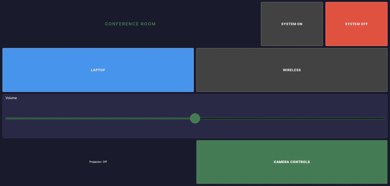
The buttons still turn blue for the selected source and green for system on, because those colors were left to the bindings. Everything else came from four class rules.
Three details worth copying:
- Define the palette once at
:root. A customer color change becomes one edit. --el-accentand--el-surfaceare the per-element versions of the theme accent and surface colors. They are how you recolor the moving parts of a fader or slider, the fill and the track, rather than just the box around them.- Leave state colors to the bindings. If you do set one from the stylesheet, the Custom Classes section tells you which control you just took over.
Page Backgrounds
Each page can have its own background color, image, and gradient overlay. Configure page backgrounds by clicking on the canvas with no element selected. The Properties panel shows the page-level settings. To set a default background for the whole theme, use the Page Background section in the Theme Studio; a per-page background overrides it.
| Property | Description |
|---|---|
| Background Color | Solid color behind everything on the page |
| Background Image | An uploaded asset (use the Asset Picker to select) |
| Image Opacity | Reduce image opacity for readability (0.0 to 1.0) |
| Gradient Overlay | A two-color gradient rendered on top of the image |
A common pattern is to set a full-bleed background photo with reduced opacity and a dark gradient overlay. This creates an attractive background that does not interfere with button readability.
Keyboard Shortcuts
Press Ctrl+/ anywhere in the Programmer IDE to open the keyboard shortcuts reference panel. Common shortcuts include:
| Shortcut | Action |
|---|---|
| Ctrl+Z | Undo |
| Ctrl+Y | Redo |
| Ctrl+C / Ctrl+V | Copy / Paste element |
| Ctrl+D | Duplicate element (a container comes with its contents) |
| Delete | Remove selected element |
| Arrow keys | Nudge position (Shift for a larger step) |
| Alt / Option (held) | Ignore snapping for this drag, resize or nudge |
| Ctrl+P | Toggle preview mode |
| Ctrl+E | Toggle element palette |
| Ctrl+Shift+R | Reload scripts (in Script Editor) |
See Also
- Programmer IDE Overview. IDE layout, state concepts, and typical workflow.
- Macros and Triggers. Command sequences and automation conditions.
- Variables and State. User variables, device states, and activity monitoring.